Architecture, Colour, Home, Interior design | 08 October 2021
Colour in home design.


“Colour is a power which directly influences the soul,” Wassily Kandinsky.
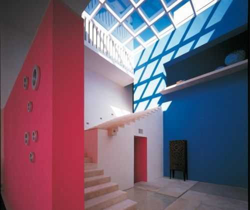
Our choice of colour is an expression of personality and identity. Colour affects our mood and changes our perception of the spaces we inhabit, because we make subconscious connections and associations based on experience and memory. In his seminal work The Interaction of Colour, Josef Albers states that, “if one says red, and there are fifty people listening, it can be expected that there will be fifty reds in their minds. And one can be sure that all these reds will be very different.”
The psychology of colour has long been recognised as an important factor in architecture and design because it evokes spontaneous emotional reactions. “Bright colours can energise us; mellow colours soothe us,” Kaan Gokcakan. Whilst it is widely accepted that colour directly impacts the way we feel, its impact is often overlooked during the process of designing our built environment.
According to The Colour in Design Award (CIDA) website, colour impacts and “demands our attention, communicates ideas, connects us together and offers a richer experience of the world around us.”
The Kiss House team have something of an obsession with colour. Several of us studied fine art or textile design and find ourselves drawn to, and inspired by, colour, pattern, and texture — all of which are abundant in our office, whether in batches of samples or in our clothing and accessories. Needless to say then, that we loved developing the Kiss House brand colour palette. We worked with the wonderful team at LukeCharles Studio to create a brand and palette to express everything that was important to us when communicating ideas about our homes and work.
Our brand values and vision, the desire to express the lifestyle that our homes offer, and our key design inspirations: The Case Study Houses, Bauhaus and Frank Lloyd Wright, were our stating point. The first iteration of our palette was simple and minimal; it was beautiful and felt calm and refined. However, we soon realised that it was too tightly constrained to convey the richness of the lives that would be lived in our homes. Our emotional response was that it was gorgeous but that we had to push harder for it to feel right.
“Our brand values and vision, the desire to express the lifestyle that our homes offer, and our key design inspirations: The Case Study Houses, Bauhaus and Frank Lloyd Wright, were our stating point.”
Carli Jordan
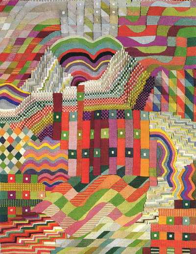
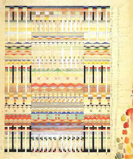
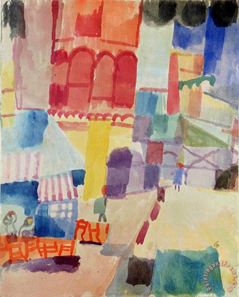
We continued the design process by creating a brand colour board on Pinterest and as we refined it, we found that Bauhaus tapestries, especially those of Gunta Stölzl, appeared more than anything else so we began to add images around these. We continued until we felt that the colours were expressing all we wanted them to — a joyful and vibrant living experience within a calm, supremely comfortable, and beautifully detailed living space. The end result was a significantly expanded brand colour palette.
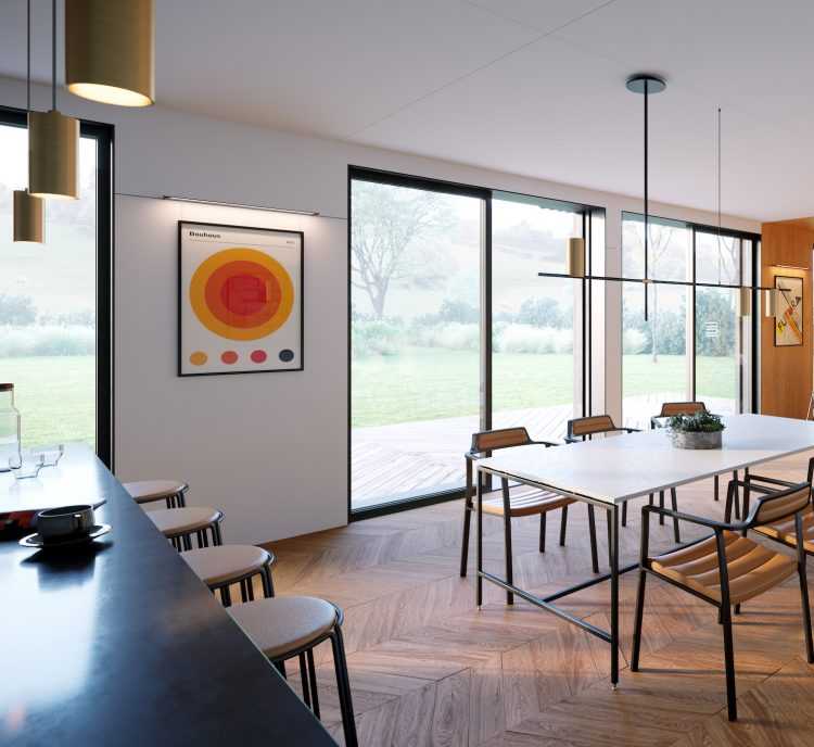
Reflecting on the process now, it was perhaps inevitable that Bauhaus tapestries would come to feature so highly in the work. Tapestries have a long association with home having provided colour, warmth and narrative to living spaces for centuries. In the case of the Gunta Stölzl tapestries, their aesthetic is beautifully balanced. It is modern and joyful, with blocks of bright expressive colour, and geometric lines. Plus of course they are woven textiles and as such naturally express warmth, comfort, well-being, and a sense of home. Moreover, the Bauhaus is a key design reference for our team — firstly Bauhaus literally translates as “construction house,” on top of that we are drawn to the design principles, the love of craft balanced against the use of new technologies, the geometry can clean lines, holistic approach to art and design and much more besides.
When considering the use of colour within instantly recognisable Bauhaus designs, people often think of a bold and bright palette featuring red, blue, black, and yellow. When you look beyond this, for example at Bauhaus textiles and painting, these colours still feature but the palette extends greatly and is at once complex and subtle. In addition to the Gunta Stölzl tapestries we were hugely drawn to the simple geometry and subtle colour studies in the printing and weaving of Anni Albers — beautiful ochres, greens, blues and yellows and delicate pinks. We also love Paul Klee’s drawings and paintings especially those from his trip to Tunisia with their luminous light and exquisite hues. Ultimately, we went with colours that we loved, based on our emotional response and a clear idea of what we wanted to achieve.
“We followed the emotional response we had to these colour references until we felt that they were expressing all we wanted them to — a joyful and vibrant living experience within a calm, supremely comfortable, and beautifully detailed living space.”
Carli Jordan
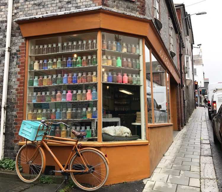
We had unknowingly followed the advice of the colour experts at Colour Makes People Happy, a paint-shop in Lewes, who say “Choose the colour you like… Don’t listen to anyone else. Be bold.” Their advice is based on the premise that colours chosen based on personal values will undoubtedly help you feel an emotional connection when applied to living space, they will make you feel invested in a space for longer than a trend-based choice. This is because we form deep-rooted connections with colour because our colour choices represent our personal beliefs.
It therefore follows that we can use our choice of colour to create a desired atmosphere or psychological mood within a space. In this way we can support the function of the space. There have been a variety of studies that explore the psychological effects of colour on individuals within certain environments. For example the Pink Prison Experiment (Schauss, 1979) which showed that convicts placed in bright pink jails were less aggressive than those that weren’t. Fans of the film Paddington 2 will recognise a retelling of this in the film when Paddington’s sock gets caught in a washing machine — before you know it everyone is in pink and baking (or eating) petit fours and listening to bedtime stories!
“Choose the colour you like… Don’t listen to anyone else. Be bold.”
Colour Makes People Happy
“In Biophilic design, colours are inspired by nature on the basis that some of our most positive connections to colour derive from the great outdoors.”
Kiss House interview with Oliver Heath
In Biophilic design, colours are inspired by nature on the basis that some of our most positive connections to colour derive from the great outdoors. In our interview with architect and Biophilic designer Oliver Heath, he explained the Ecological Valence Theory that suggests we react well to colours we have previously had positive experiences of, for example, “shades of blue remind us of cool, calm pools of water to encourage relaxation. Green is a more creative and energising colour and is a good colour for stimulating conversation. Yellows are warm and welcoming, sociable colours. They remind us of ripe crops in summer and the warmth of summer sunshine. Oranges and reds are quite stimulating, energising colours and should be used in appropriate proportions.”
Interestingly our reaction to certain colours is not always governed by our psyche, rather it can be influenced by genetics, age, personal experiences, cultural identity, and heritage. A person may dislike the colour red after being involved in an accident, for example, because subconsciously they connect it to blood. Someone of English origin may associate the colour green with feeling sick, however for a German, this suggests hopefulness. As Johannes Itten wrote “the effects of colour are controlled by intuition.”
Architect Ricardo Legorreta Vilchis adopted exuberant colours into his designs to reflect his Mexican culture and Yinka Ilori, multi-media artist, brings stories to life through his designs which are heavily influenced by European and Nigerian cultural traditions expressed in brilliant, vibrant colour. What is interesting about their work and the ideas in Biophilic design is the movement away from thinking about colour as paint on a wall — colour is everywhere. It is in the accessories and soft furnishings we use, it is in the plants we bring into our space, the materials we construct our built environment out of and the art we adorn it with.
“Colour is everywhere. It is in the accessories and soft furnishings we use, it is in the plants we bring into our space, the materials we construct our built environment with, and in the art with which we adorn it.”
Carli Jordan
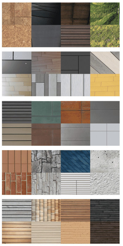
Material choice is another thing we have a great passion for at Kiss House, we are instinctively drawn to natural materials and have a policy of using them whenever possible. We do this because of their sustainability credentials and physical properties. We are drawn to the warmth, tactility, tone and texture of timber, and some of the boards made from recycled fibres such as Valchromat and Honext. Working on cladding studies for different projects has been an interesting exercise in material, colour and texture resulting in us developing simple palettes, sometimes with accent materials (used very sparingly) such as Corten / weathered steel, which has beautiful copper tones and a rust like patina.
The relationship between the interior and exterior elements of a house build project can be enhanced by connecting colour and material choices in order to provide coherence and interest. For example, a material used externally to accent a window shroud can be picked up and used internally to finish a window seat. In our recent story Colourways drawn from the landscape we explored the work of landscape colour expert Jem Waygood and related this to one of our own projects. Another way to celebrate the connection between our exterior and interior spaces is to add plants to our homes bringing the colours and textures of nature into our interior design. We explore this in in our stories Bringing nature in and House plants for the soul and in our interview with designer Daniel Heath who takes much of his inspiration from nature.
To conclude: colour choice is personal and is important because it affects how we think and feel. Colour not only reflects our identity, but it can enliven and enhance the atmosphere and mood within our home affecting how we behave within it. As a result, colour should be central to the design process — whether that is in relation to how we work at Kiss House, where consideration of colour happens throughout our work, or in decorating our homes.
The brilliant thing is that we can play with colour and texture through the materials, artwork, soft furnishings and items we use to construct our homes because there are no rules — it’s about what we like and how we feel. Enjoy it!
Never miss a story by signing up here
Further reading
Kiss House Pinterest Brand colour board
Kiss House: An interview with Oliver Heath
Kiss House: House plants for the soul
Kiss House Pinterest Bauhaus board
Kiss House Colourways drawn from the landscape
The effects of colour on the moods of college students.
Interaction of colour: Josef Albers
Related stories.